The global average email marketing ROI in 2020 was 3600%, and email marketing returns are expected to continue growing. That means, if you have the right email marketing strategy in place, you could be making a huge return on your investment.
We’ve already discussed what some of the best email subject lines are to get readers opening up your emails in their inbox, but how can we take it a step further and ensure your contacts actively engage with the content you provide.
A simple way to start increasing your engagement, is to consider the look of your template as well as the content you’re providing.
We spoke to our Design Team about their favourite examples of engaging templates from some of our own clients. Let’s unpack them below.

Videos in emails can increase your click-through rate by up to 300%. That’s a whole lot of extra engagement!
Now, before we show off some of our favourite examples of newsletters making use of video, we have one caveat. Most email inboxes won’t autoplay your videos, so you’ll need to host your video somewhere else (think YouTube or your own website) and you’ll need to get creative in how you display your videos in your newsletter.
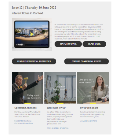
The below email from Ray White Surfers Paradise for instance, smartly mocks up their video on interest rates, so that it appears as it would on a device. The yellow play button also works as a call-to-action.
Add to this, the text excerpt beside the video offering more information and the call-to-action, ‘Watch Update’ button.
Everything is clearly pointing out what steps you need to take to view the update in full and it looks great on the page!
Other emails use gifs to display part of their video within the newsletter itself. The example below uses a short gif of the title card of their Epik Video market report. Their contacts can then click the gif to view the full video.
We call this content ‘thumb stopping’. Not only does the use of a gif here act as an easy shorthand for video, it also stands out from the static content making users more likely to stop their scrolling to view it in full.
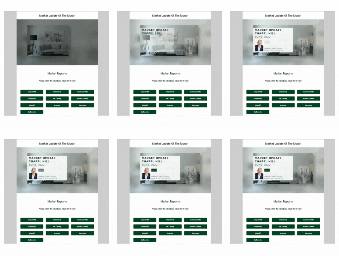
We also love the buttons below, linking to further market reports. This gives users a clear indication of where they should stop next for more information.
Of course, you can’t generate actions through your email marketing without using ‘call-to-actions’. A call to action(CTA) is essentially the part of an email, website or ad that encourages your audience to do something, helping to convert a reader to a new lead.
A great way to present a CTA in your email marketing is to use a button or banner.
Many marketers recommend the inverted pyramid method when it comes to CTAs in your emails.
This method focuses your audience’s attention on your call to action, removing other distractions.
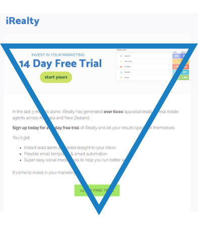
Start at the top of the inverted pyramid by grabbing attention. In our above example, the attention grabbing offer is a free trial. In the middle you should be building anticipation or explaining your offer. This is where most of your text will come into play. Then finish up with a button call-to-action!
You’ll notice in this method, that the layout of the template points you to the call to action at the bottom.
Along with using buttons, branded banners in your newsletter will help your CTAs stand out amidst text. This example from Harcourts Solutions below not only ties in perfectly with the Harcourts brand, it also offers extra information on why you should click the banner – The market has boomed!

Others use gifs for that extra element of ‘thumb-stopping’ content.
The examples below show how simply this can be executed while still making a huge impression on the look of your newsletter.
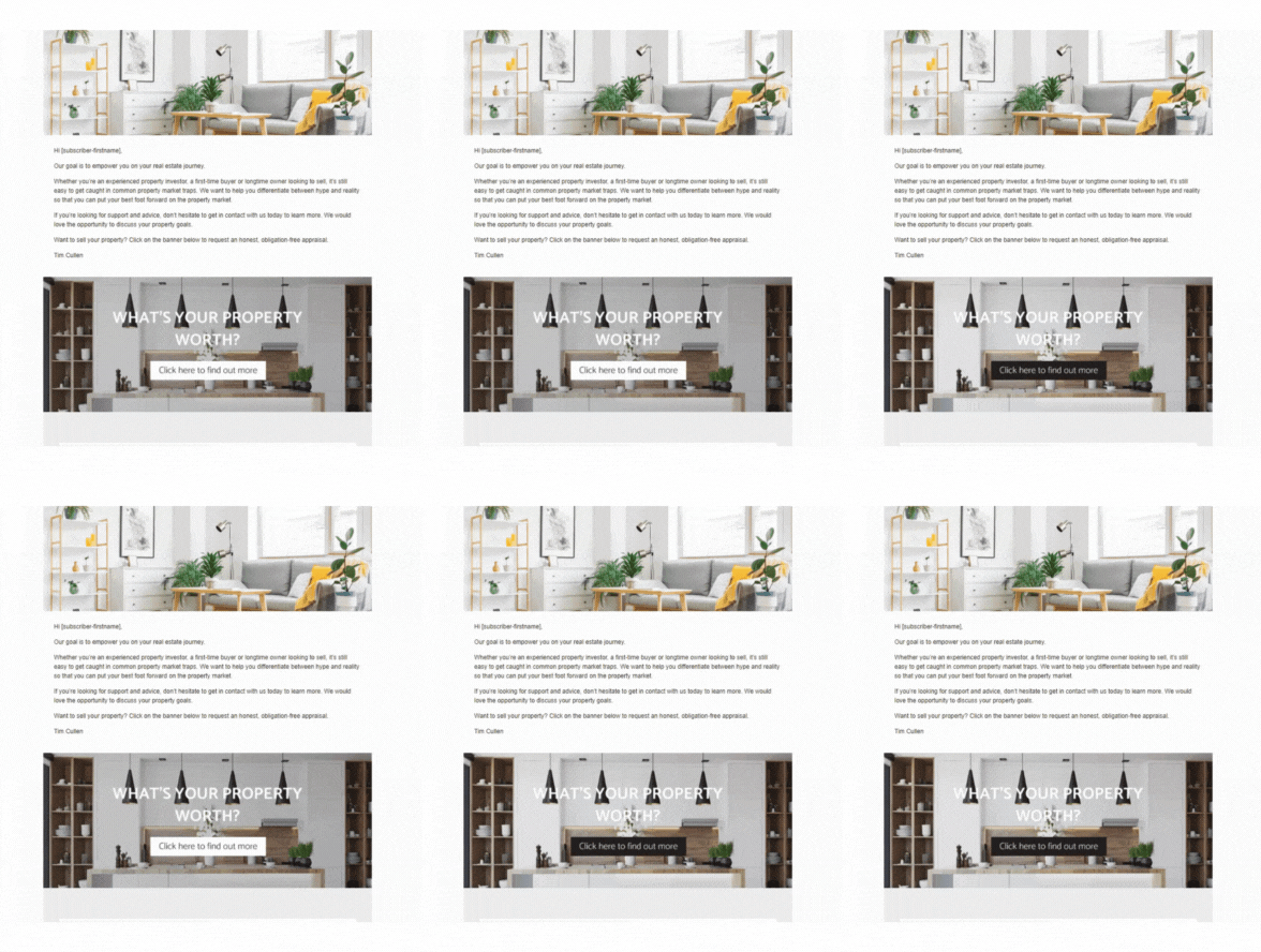
But, before you start adding your gifs, take a step back and make sure you’re not adding too many! The reason gifs in your newsletter tend to be more engaging is because they stand out from static imagery and text. If you’re packing your email with too many gifs, that effect is lost.
But, don’t worry, in all our talk of buttons and banners we haven’t forgotten about one of the most important elements of your newsletter… The properties.
We know you’re not going to forget to add listings to your newsletter! But, another valuable section to add are your coming soon properties. These add an element of exclusivity to your newsletters. You’re offering information that your contacts can’t get on your website, on any other real estate platforms or even through social media.
We love the simplicity of this Coming Soon section!
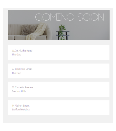
This client has chosen to use a list property section, so the information is narrowed down to the bare bones – Just the property address. In this way your contacts get just enough information to call or email you directly to learn more.
It also keeps your newsletter short and readable, so you can devote more space to your live listings.
Speaking of readability, when it comes to adding sections to your email templates it’s always important to consider the user experience of your readers.
We’re all busy people with a lot of emails in our inboxes, so keep things short and sweet. But, that doesn’t mean it’s impossible to provide valuable information. The key is to display this information simply, and redirect to landing pages for more content.
A quick links section is the perfect way to do this. You can change out your quick links in every email you send or you can choose evergreen links you think it’s important your readers have access to in every send. This example from Belle Property below uses evergreen links.
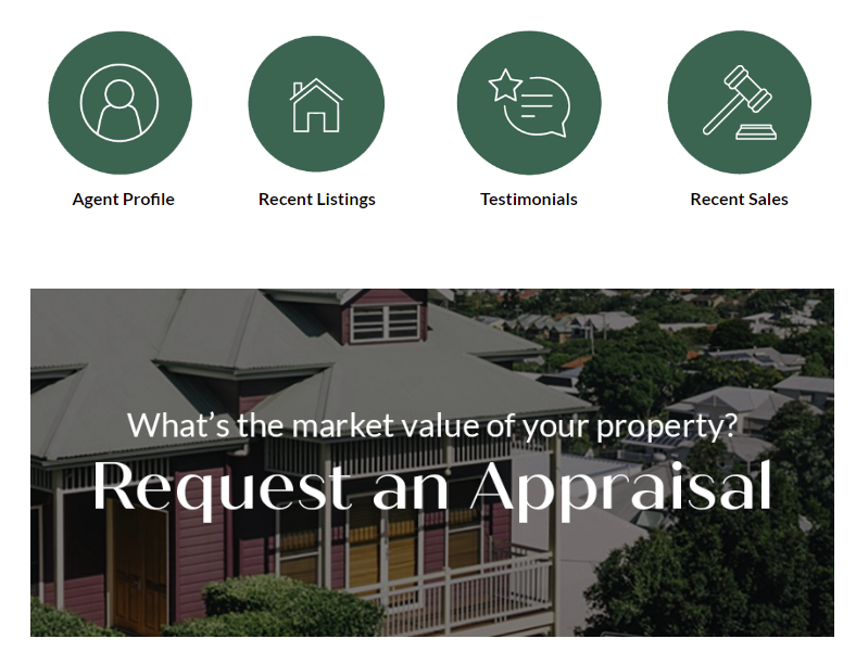
These quick links to an Agent Profile, Recent Listings, Testimonials and Recent Sales are displayed in every newsletter sent out from this client. They work because they’re beautifully branded, clear and simple, plus they’re linking to valuable, relevant content.
These are also a useful tool for tracking user interest. Check in on your reports to find out who is regularly clicking on your sales results and testimonials and call those people to see if they need any information on those results directly from you.
You can also use iRealty article sections, image sections and banner sections to display branded content.
This RE/MAX office uses branded graphics to share tips and facts, as well as promote their latest magazine issue. Content like this is brand building, because it’s coming directly from you.
Blogs, ebooks, market reports and other guides are all brand building pieces of content to share in your newsletters.
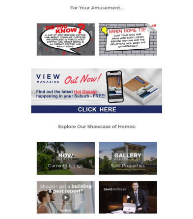
Even linking to properties in this newsletter example is a branded tool, with unique portfolio names and images.
Your newsletter template is a flexible tool that you can use to create unique, brand building content that your contacts will actually be excited to read.
There are plenty of easy ways you can make your content stand out from the crowd of real estate emails. Download our email audit checklist to discover if your emails have the right components to build your brand, generate more leads and keep your contacts engaged.